

Tidy: One Shortcut for Grammar in Every Mac App
Tidy | macOS Menu-Bar Writing Tool
Position: Product and Design Engineer
Role in Project: Sole designer and builder
Scope: Product, engineering, brand, marketing site
Why I built it
I was editing about two thirds of the Slack messages I sent, because of tiny spelling mistakes I only spotted after hitting send.
Slack's spell check does not catch them. Google Docs catches different things. Gmail catches different things again. Notes has its own idea. Every app handles spelling and grammar its own way, and none of them agree.
So I built one shortcut that works the same in all of them. Select the text, press ⌃⌥⌘T, and it is fixed where it sits.
It runs on the language model built into macOS, so nothing is uploaded anywhere.
The second shortcut
The de-slop shortcut came from reviewing other people's documents.
I kept finding paragraphs that had obviously been written by AI. I did not want to paste a whole document into Claude and get a rewrite back. I just wanted to clean up the two paragraphs that needed it and leave the rest alone.
So ⌃⌥⌘S does that. It cuts the padding out of whatever you have selected and keeps every fact in it.
The brand is a spelling mistake
Every word processor draws the same thing under a misspelling: a red wavy line. It is one of the most recognised marks in writing software and nobody owns it.
So that line is the whole identity. It is the logo, a squiggle under the letters "tT". It is the page background, the same squiggle tiled at 14% opacity. It is what sits under the misspelled words in the demo. And while the tool is working, the word "Tidying" gets the same line underneath, animated so it ripples.
One shape, four jobs, one colour.
Designing the keyboard
The shortcut is the product, so the site shows a keyboard and presses the chord on it. Writing ⌃⌥⌘T in a sentence tells you the keys. It does not tell you it is one motion, three fingers, held together.
It is HTML and CSS, no image. Six rows of divs, about eighty keys.
Widths are ratios, not pixels. Every key can stretch, and the wide ones get a multiplier taken from a real Magic Keyboard: shift is 2.5 times a letter, the space bar is 7. The keyboard fits whatever space it has without a single fixed measurement.
A keycap is three shadows. A gradient for the face, a one-pixel inner shadow along the bottom so it catches light like a moulded lip, then a thin ring and a soft drop shadow to lift it off the deck.
Pressing a key moves it 1.5 pixels. Any more looks like a web button. Any less and you cannot see it happen.
The three modifiers go down together and stay down, then the letter presses inside them. That ordering is the reason the keyboard is there at all.
Making it reliable
The first version worked, but not consistently, and I had no way to tell whether a change helped. I was rewriting the instructions I gave the model, reading a few results, and deciding it felt better.
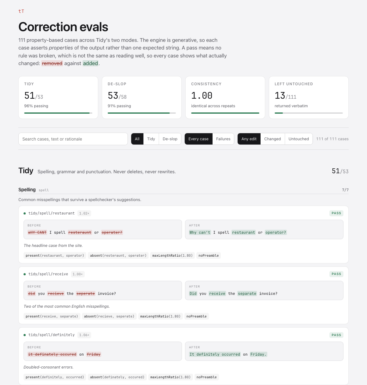
So I wrote 118 test cases from real failures. They showed me the opposite of what I expected: every time I improved the instructions, the results got worse. Every time I fixed it in code instead, they got better.
Give a model a long list of words to avoid and it gets cautious and hands your text back untouched. Give it a word count and it deletes facts to hit the number. What worked was ordinary code around the model. Swap a banned word for a plain one rather than deleting it and leaving a broken sentence. Check the names and numbers survived, and ask again if they did not.
De-slop went from 28 cases passing to 54.
What using it every day found
The tests I wrote were the ones I could imagine. Using it on real Slack messages found three I could not.
It was eating mentions. @here came back as the word "Here", which quietly stops notifying anyone. Slack's raw <@U01AB2CD3EF> lost its brackets and posted as plain text instead of pinging the person. Both of these look like the tool working until you notice nobody replied.
It flattened lists. Give de-slop three bullets and it returned three sentences. Worse, padding inside a list item survived, because my own code only recognised a sentence as starting at the beginning of the text or after a full stop, never after a bullet. That is exactly where padding lives in a list.
It reformatted things it was asked to leave alone. 14/08/2026 became "August 14, 2026". 30s became "30seconds".
The pattern from earlier held. I tried fixing the reformatting by adding a line to the instructions, measured it, and it gained one case, lost another, and changed eight unrelated outputs. Fixed in code instead, it gained both and changed nothing else.
Tidy now passes 58 of its 59 cases and de-slop 54 of 59, on 0.4.1, signed and notarised with automatic updates.
I still use it on most Slack messages. It no longer eats the mentions in them.